Tuesday, November 6, 2012
It's Carnival time!
The November edition of the Carnival of Pen, Pencil and Paper is hosted by the lovely Goulets over at Ink Nouveau, here. Be sure to check it out for a variety of interesting reads!
Monday, November 5, 2012
Distraction
So, yesterday when I was trying to take photos of the Zenok Leather notebook cover, I ended up playing peekaboo as well. I thought some of you might find this picture fun. (If not, feel free to skip right past...)
And, yes, we own...um...a lot of books. Probably a few thousand. And counting. |
| Gandalf, checking out things from the footrest of an antique accountant's stool that now serves as a plant stand in my family room. |
Happy Monday!
Saturday, November 3, 2012
Lemmings. (Lemmings? Read on.)
This chapter of the ongoing Notebook Dilemma is brought to you by this lovely little notebook.

(As always, all photos are clickable to enlarge)
And here's the story.
For a while, I've been lemming the Midori Traveler's notebook. 'Cuz, you know, I need more notebooks. (Doesn't everyone?)
My hesitancy in jumping off of that little cliff was that the Midoris are nonstandard sizes - in all of my wanderings around the Web I could not find anyone else who made an insert that would fit nicely in a Midori. Other than Midori. My hope was to have a notebook that could be an everyday carry, and I am always hesitant to adopt something that has a limited supply chain if I intend to use it often.

Enter this little beauty by Zenok Leather. Frankly, I'm not sure how I found this, other than perhaps on one of my perambulations through the Etsy website. It's fairly close in execution to the Midori, with a few obvious differences. One of the big selling points for me was the fact that it holds a 3.5x5.5-inch notebook - and there are several manufacturers out there who make notebooks in that size. Hooray!
Plus, it's made by one of my neighbors to the north in Vancouver, BC. It's always good to support your neighbors.
I'm sorry to say that I didn't think to do an unbox for you; I hadn't initially contemplated reviewing the notebook cover, only the inserts I bought to play with. My recollection is that the packaging was simple; I believe it came in a standard shipping box, wrapped in tissue inside a Ziploc-type bag. It came with extra elastics, and just looking at it, it seems like it would be easy to replace the elastic with whatever one you chose to pick up. They are simply cut to size and knotted into place.


The cover is obviously handmade, and initially I was somewhat taken aback because I hadn't realized it would be as pale as it is - but it's grown on me quickly, and is already starting to show some of the signs of use and wear that a well-loved leather item will. The maker does offer several color combinations as well. The chop on the front is the shop's name, and I understand one can have it monogrammed instead if desired.
 |
| Photo courtesy of Zenok Leather. Used with permission. |
What do I like about this? Elastics to hold up to four notebooks or cahiers. The leather tab on the elastic closure that can double as a pen loop. The leather tab on the spine, which doesn't stick out as far as the metal bead Midori uses. The two-tone leather. The multiple color choices.
This little guy has been riding around in my purse with me for a few weeks now, happily serving as a secure place to jot down a few notes, hold receipts and business cards, and whatever else I may need. No Midori lemming any more!
This just goes to show you don't have to stick to the big makers for products that will serve you well.
Coming soon - the review and comparison of the various notebooks and cahiers I purchased to serve as the innards. No lemmings were harmed in the making of this blog post. Despite the previous use of the word "innards."
Friday, November 2, 2012

Sunday, October 28, 2012
Rollerball Roundup
I have long been intrigued with the idea of a refillable rollerball - a truly refillable one, capable of using fountain pen ink in its myriad of colors and makers, and not a rollerball insert confined to a manufacturer's idea of what colors might be appropriate or popular.
With that in mind, over time I have purchased three of the more budget-friendly models: the Kaweco Sport rollerball, Noodlers rollerball, and the J. Herbin rollerball. Each has its advantages and its drawbacks.

With that in mind, over time I have purchased three of the more budget-friendly models: the Kaweco Sport rollerball, Noodlers rollerball, and the J. Herbin rollerball. Each has its advantages and its drawbacks.
Tuesday, October 23, 2012
Sneak preview: notebooks, the continuing saga
Just a hint of something coming up soon here...

A new chapter in the ongoing quest for a notebook I really like.

A new chapter in the ongoing quest for a notebook I really like.
Monday, October 22, 2012
In celebration of fountain pens: Fountain Pen Day
Many have lamented the apparent passing of the days of good penmanship. Alarmist comments abound that computers have even robbed us of the tactile experience of handwriting, replacing it with keyboard pounding or phone texting (or often in my case, the rather retro experience of dictating to Siri - "Dear Mr Jones Comma Next Paragraph" hearkens back to my early days as a professional, dictating correspondence into a tape recorder or a phone-in system. Yes, I am that old).
In all this flurry of worry, it's nice to see a ray of hope - the first annual Fountain Pen Day. I like the idea of celebrating the fountain pen and the experience of handwriting.
Besides, the nice folks behind FPD #1 are having a giveaway of one of the famous TMLee journals, which is reason enough to celebrate! I have one (and, no, I still have not been able to make myself write in it!) and they are works of art!
Why don't you drop by the FPD website and see about entering? And while you're at it, mark your calendar for November 2, the first annual Fountain Pen Day. I am resolved to use nothing but fountain pens all that day, which may astound and annoy my coworkers...they'll just have to cope.
And I may have to buy another fountain pen to celebrate. Hmm.
Saturday, September 8, 2012
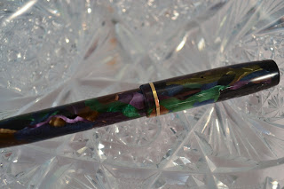
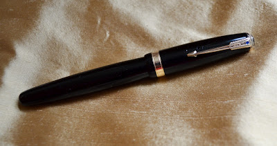
And, a dandy of a Dandy
I have mentioned several times before my liking for - um, flashy things. Bright, shiny, pretty pens are my undoing. (Well, to be honest, bright, shiny, pretty things in general cause trouble for me.)
I don't know how I ever settled on this being one of my Bucket List pens; I suspect I saw a photo of one somewhere and said, "Wow! Gotta have one!" and then started looking. And looking - these are a bit hard to find in this color, and they tend to be budget-burning if you can find them, so I had to look for quite a while to find one that I felt comfortable with, pricewise. To be truthful, I wasn't settled on the pen model as much as I was the material/colorway, which Conway Stewart called Peacock.
(As always, all photos are clickable)

It's an interesting material. If it's not well-lit, it almost looks a little benign. Get some brighter light on it, though, and it blossoms.
And my reaction to that was to place it in the pen box as if it were made of spun glass. And leave it there.
At any rate, I can now report that I have inked the pen and used it. It is beautiful to behold, and surprisingly comfortable to use; it's not very big, and certainly not so by modern standards, and it's light in the hand. (Of course the current fashion for pens seems to include OverSize Big Behemoth Pen of Doom sizes.) The balance is better if the cap is posted, and it's a bit short without, but I doubt I would post the cap often - I don't tend to write that way anyway, and with the fragility involved here I don't want to stress the poor little thing any more than necessary!
The nib is a capable 1930s nib, with little flex - and I don't want to put much pressure on any aspect of this pen, lest I cause more damage!
Regardless, I thought you'd enjoy seeing the pen and the gorgeous coloring. It is indeed a dandy of a pen!
I don't know how I ever settled on this being one of my Bucket List pens; I suspect I saw a photo of one somewhere and said, "Wow! Gotta have one!" and then started looking. And looking - these are a bit hard to find in this color, and they tend to be budget-burning if you can find them, so I had to look for quite a while to find one that I felt comfortable with, pricewise. To be truthful, I wasn't settled on the pen model as much as I was the material/colorway, which Conway Stewart called Peacock.
(As always, all photos are clickable)

It's an interesting material. If it's not well-lit, it almost looks a little benign. Get some brighter light on it, though, and it blossoms.
 |
| Imprint reads: THE DANDY PEN No. 720 Conway Stewart London -------MADE IN ENGLAND------- |
I bought this particular pen off of the Bay a few months ago. It came to me all the way from Scotland, where it had been part of someone's estate which was being liquidated. The pen has a couple of cracks - in fact, I found one while taking photos for this post. (I think it's a second one, and not an extension of the one mentioned below...though I'm not sure.)
 |
| Yikes!!! You can see it here, extending through the blue and purple |
It came to me with a crack that ran from the pivot end of the lever across the body of the pen, perpendicular to the lever. The affordable price was related to this issue, and I rolled the dice a bit in buying it, but it seemed fixable to me so I went for it. I sent it along to one of the more well-known pen restorers in the US; he tried everything he could think of to stabilize the material, trying various techniques of "plastics welding," and he wasn't as successful as he would like to have been. The crack is not nearly as noticeable, but he doesn't feel it's totally reliable and cautioned me against much use of the pen, recommending I treat it as a delicate item.
And my reaction to that was to place it in the pen box as if it were made of spun glass. And leave it there.
 |
| Before restoration. You can see the crack here, extending down through the green and blue. |
 |
| And, after restoration. I can't really see it without a loupe. (This also gives you a good look at the CS logo on the lever!) |
A while ago, I posted on this pen and the mandarin Duofold, commenting that I really need to be careful with the attitude of "too nice to use." Frankly, I think it would be easier for me to replace the Duo if something should happen to it - they're not cheap, but at least they're available. I've only seen a couple of Conway Stewarts in the peacock colorway come up for sale in the year or two I spent looking; again, not cheap but even availability is an issue.
At any rate, I can now report that I have inked the pen and used it. It is beautiful to behold, and surprisingly comfortable to use; it's not very big, and certainly not so by modern standards, and it's light in the hand. (Of course the current fashion for pens seems to include OverSize Big Behemoth Pen of Doom sizes.) The balance is better if the cap is posted, and it's a bit short without, but I doubt I would post the cap often - I don't tend to write that way anyway, and with the fragility involved here I don't want to stress the poor little thing any more than necessary!
The nib is a capable 1930s nib, with little flex - and I don't want to put much pressure on any aspect of this pen, lest I cause more damage!
 |
| I love the heart shaped breather hole! |
Given the cracking and the relative rarity of the pen (or at least of the colorway), I am likely to leave it in the pen box more often than not - not as too nice to use, but a treasure to treat with caution and respect.
Regardless, I thought you'd enjoy seeing the pen and the gorgeous coloring. It is indeed a dandy of a pen!


Monday, September 3, 2012
A sweet pen - in more ways than one
I have a particular fondness for 1930’s and 1940’s
fountain pens, especially when brightly colored, made of celluloid or other
early plastics. I think they’re pretty – and, on the whole, they are rather
simplistic things, which means that they often still work well without being too
finicky.
I’ve bought several, and will undoubtedly continue to pick
them up as I see ones that catch my eye.

As always, all photos are clickable
Some of them are relatively fragile, and in an earlier post
I mentioned that I had not plucked up the courage to use a couple of newer
acquisitions for fear of damaging them. On the other hand, while I would hate
to break either pen, neither is so precious it would be a loss to humanity if
something happened – though my feelings might be a bit hurt.
Tuesday, July 3, 2012
The Marx Bros Clean A Fountain Pen
Or, how not to flush a nib.
Don't try this at home.
So, this morning I'm rushing around trying to pick up a few things before I get ready to go to work. I fed the parrot and was putting his dirty bowls in the dishwasher, when I spied a glass on the countertop that had about an inch of water in it. I could tell that Joe had been cleaning pens yesterday, and I thought to myself, "RatzlFratzl! that guy left a glass with an inch of water on the counter when he finished!" and picked it up and dumped it in the sink preparatory to putting the glass in the dishwasher Where Dirty Dishes Belong.
And heard a little rattly-tink as the water went down the disposal. Along with a fountain pen nib unit.
Says I, "Oh no! I just dumped a nib down the disposal!"
Says Joe, "Don't worry, I'll get it. You go get ready for work."
And then he proceeds to...hit the switch...for the disposal. Instead of the light switch right next to it.
Thereby destroying for all time an Esterbrook 1551 nib unit. We think he managed to fish out all the pieces. The disposal seems okay; it's a restaurant grade and reportedly can handle anything up to chicken bones, but I've never pushed it that hard; I don't have the courage.
So, if anyone has a nice 1551 unit they'd like to sell, we're in the market for one.
It is a full moon today, by the way. Be careful out there, friends.
Sunday, June 24, 2012
Too Nice to Use
I think most of us have heard of a collector who purchases
items for the mere sake of having them. This happens with fountain pens, as
with many other items; I’ve seen articles about these people, some of them
famous (for other reasons), who have rooms full of glass cabinets in which lie
“collectible” pens as if lying in state.
Of course the pens are never used; they’re collectible after all.
I’m going to be snarky here – Joe and I have always treated the thought of such pens with a fair amount of derision, referring to them as “beanie babies,” and marveling in a horrified fashion at the amount of money that can end up invested in these collections.
I’m going to be snarky here – Joe and I have always treated the thought of such pens with a fair amount of derision, referring to them as “beanie babies,” and marveling in a horrified fashion at the amount of money that can end up invested in these collections.
I’m not talking about preserving the one example left of a
rare, antique pen, rather more about things like the Sylvester Stallone pens,
which to me have reached a new height of the ridiculous, and at a price that
equals it.
I have always prided myself in thinking that, if I buy a
pen, I am buying it to use as a pen and not to put on a shelf and admire.
Well, pride goeth before a fall, as we all know and I am
about to be reminded.
I have a few items that I have only semi-consciously labeled
“too nice to use.” They’re not tucked away in display cases, but I still have
never used them, for varying reasons.
Three come to mind in my fountain pen hobby:
1.
The Conway Stewart Peacock – I purchased this pen off
of eBay, pounced on it actually, as it’s a rather rare color and only the fact
that it’s the “Dinkie” size made it affordable for me. The pen has a crack in
the barrel, extending from the forward end of the lever perpendicularly out
about an eighth of an inch. I sent the pen out to one of the foremost restorers
in the US, and despite all of his efforts he was unable to weld the crack
together to stabilize it. Thus, the pen is a tad bit fragile; that, combined
with the rarity of the color, has prompted me to leave it in the pen case since
it came back from the shop.
2.
The yellow Duofold. I even posted photos of this pen
just after I acquired it, then sent it off to be cleaned up and resacked. And
then put it in the pen case and left it there. The old yellow Duofolds are
known to be fragile, because something about the components in the material
used for the yellows has not aged well and makes the material brittle. Once
again, it might be fragile, and it's a bit of a rare color, so I let it sit and sulk in the pen box.
3.
The TMLee journal. TMLee, of Singapore, makes lovely
handmade journals, and sells them on the Fountain Pen Network. The saga of his
self-taught skills journey can be found in what is probably one of the longest
threads on FPN, here. This journal is beautiful, precise, and pristine; I can’t
bring myself to write in it. It feels as if something momentous should be
written in it, but I lead a perfectly ordinary life and doubt I will ever have
occasion to write “Today I won a Nobel Prize” or even “Today I won the
lottery.”
My goal over the next few weeks is to consciously use these
items, and get over my reluctance. What is the worst thing that can happen? A
pen breaks. Well, no one will die or go bankrupt if that happens, and I doubt
any wars will result. I write something less than worthy of preserving for all
posterity, something not so awe-inspiring as to create a sensation or even
become a meme. Oh well.
I will then dedicate a blog post to each of these three
items, so you can see them for yourselves and hold me to my word.
Target acquired; stand by.
(Azizah, this one's for you; your comments about Rhodia Dot Pads got me to thinking!)
Saturday, June 23, 2012
A Few Words on Paper
My husband Joe is a bit of a paper snob. (Is it good for a
marriage if one calls one’s spouse something not-so-nice, particularly in a
public forum such as a blog? I guess I’ll find out.)
My evidence is this: when he was working, he would buy his own notepads in order to guarantee FP-friendly paper at work. He has gone through almost every major manufacturer of bound journal on Earth, looking for just the right one. He likes Rhodia papers, but only the grid ones (really? I never thought it made that much difference!). He has been known to dislike papers others find perfectly useable.

My evidence is this: when he was working, he would buy his own notepads in order to guarantee FP-friendly paper at work. He has gone through almost every major manufacturer of bound journal on Earth, looking for just the right one. He likes Rhodia papers, but only the grid ones (really? I never thought it made that much difference!). He has been known to dislike papers others find perfectly useable.
Lately I’ve taken a rather different approach to paper. I
see it as part of an equation, and adjust the other parts of the equation to
get the result I want.
I am better at math than he is. (This isn’t a not-so-nice
statement; it’s true. Quicken was invented for people like him.)
Many of us get to use whatever is available at work to use;
I don’t have much say on what my employer buys for copier and printer paper and notepads,
for example. As at so many other businesses (and our homes as well), we are
looking to minimize expenses, so the quality of paper available at work is –
um, questionable.
This being the case, my answer is to select my pens (and in
some cases, inks) to accommodate the fact that at work I am basically writing
on paper toweling. This means fine nibs are good for work. I get a medium line,
but that’s fine. (Yes, the pun was intended!) If I use a broad nib, it looks
like I’ve been writing with a Magic Marker.

I do appreciate paper that allows for use of a variety of
nibs, though, and one of my favorites is the Rhodia Dot Pad. My journal is
currently a Rhodia Webnotebook, and while I like the hard finish and texture
(or lack thereof) of the paper I do wish it came in white. I’ve had a few things to say before about cream-colored paper, and the color is definitely a
compromise for me; I expect I’ll be moving on to something else when I’m done
with the Webbie.
My point here is this: one of the fun things about fountain pens
for me is the chance to match the tools and materials to obtain the result I
want – or to experiment to see what happens. This is not unlike an artist
working within whatever media are chosen to obtain certain results.
With this in mind, I don’t think I can reasonably say there
is such a thing as good or bad paper, then; the stuff at work is certainly
absorbent and not prone to delivering a pleasing look with, say, a
stub nib or a broad one, but it’s inexpensive, recycled, and readily available,
all traits that could be construed as “good.”
Because of the varying papers I have available for use, my
nib preference has grown to include a variety of widths and styles as well. I
find I enjoy the variety, and the fun of trying different things to see what
works.
All of which makes putting a few words on paper all the more
gratifying.
What makes it fun for you?
Sunday, June 10, 2012
Found in the Wild
Went out for ice cream, and came home with a pen
There's a great little ice creamery about 15 minutes away from our home. It being a sunny Sunday afternoon, we decided to run out to Snoqualmie Ice Cream and grab a dish of ice cream as a treat.
Snoqualmie Ice Cream is in a fairly rural area, at a crossroads known as Maltby. Just down the street, tucked behind some other buildings, is an old antique shop we've never managed to get to before - it's not open all that often.
Well, it was open today, so in we went. And just inside the door, in one of the cases, was almost an entire shelf full of fountain pens.
Nothing terribly fancy, but a pretty wide assortment - three or four Esterbrooks, a couple of Sheaffers, two or three Eversharps - you get the idea. I got pretty excited when I saw a Parker True Blue junior for $15, but it was in pretty bad shape and had a Sheaffer student nib in it, so I passed.
I did come home with this - a Carter. Obviously used, with the de rigeur dried blue ink in it, it has a 14k nib and is in good shape with only minimal brassing. The barrel suffers a bit from the discoloring so common in certain colors of that time (about 1930). It was marked at $20, but it came home for $18 plus tax. (I paid cash, and had chatted up the owner about how it was going to a good home, I'd have it resacked and use it; I think it influenced his pricing.)
I don't think it's a sumgai find by any means, but it's a great memento of a lovely Sunday afternoon.

Oh - ice cream? I had toasted coconut, and salted caramel. Yum!
Saturday, May 26, 2012
Works in miniature
It's amazing the amount of detailed craftsmanship that can go into something as relatively small as a fountain pen nib - detail that can get lost due to scale. I thought I'd share some close-up photos of nibs that I think are beautiful, so you can see them in more detail. Enjoy!
Sunday, May 20, 2012
And now, a word about Edison
A month or two ago, I wrote a review about the Bexley Jitterbug! in which I also briefly mentioned Edison Pen. The gist of the comment was, I’d been leery of both Bexley and Edison for some time, not sure how well they, as boutique makers, would compare with the more “major” penmakers.
(as always, all photos are clickable)
Well, I’ve gotten over that little fear.
 |
| Edison Mina (above), Edison Pearl |
Well, I’ve gotten over that little fear.
Sunday, April 29, 2012
My very favorite pen
We have a lot of pens. Not as many as some people, of course, but probably somewhere north of 60, if I had to guess. (Inventory? Yes, I should...but I never seem to get it done.)
Some of them are rather flashy, and a couple of them were pretty expensive.
But my favorite pen, overall, is a rather modest little thing.
 It's a black Parker Vacumatic, probably about a 1946 vintage. It is neither a rare nor even a particularly good specimen. It's obviously well-used, and someone who owned it in the past was a pen-chewer. (I hear a certain segment of you going "ewwwwwww!" as I type.) A quick search on eBay revealed three substantially similar pens within the first dozen hits, all going for well under $100. It seems a ton of these were made, and a ton were bought, and used for years. Just like this one, which definitely shows its almost 70 years of age.
Some of them are rather flashy, and a couple of them were pretty expensive.
But my favorite pen, overall, is a rather modest little thing.

Saturday, March 24, 2012
My Favorite Inks: DeAtramentis Jane Austen
I am a big Jane Austen fan. I have read everything she wrote multiple times, including the juvenilia, some of which is - well, juvenile. I've also read a lot of fan fiction, some very good (thank you, Abigail Reynolds) and some awful.
So, when I saw DeAtramentis had a Jane Austen ink, I bought it without having a real clue (or is that "clew?") as to its colour, other than it was dark green.
It arrived in the mail the other day - and already it's hit the favourite list for me. A forest green ink that's beautiful, serene, well-behaved - rather more like Jane than Elizabeth.
Without further ado, may I have the honour of introducing DeAtramentis Jane Austen to you?

(As always, images have been color-corrected and look a perfect match to me, on my monitor. Your Monitor May Vary. If you have your heart set on a particular colour, may I suggest you first try a sample before buying a full bottle? That may alleviate disappointment.)
And, lastly, should you have a desire to see Miss Austen's manuscripts in her own handwriting (alas, not in green), have a look here. Enjoy!
So, when I saw DeAtramentis had a Jane Austen ink, I bought it without having a real clue (or is that "clew?") as to its colour, other than it was dark green.
It arrived in the mail the other day - and already it's hit the favourite list for me. A forest green ink that's beautiful, serene, well-behaved - rather more like Jane than Elizabeth.
Without further ado, may I have the honour of introducing DeAtramentis Jane Austen to you?

 |
| Here's the rinse test mentioned in the review |
And, lastly, should you have a desire to see Miss Austen's manuscripts in her own handwriting (alas, not in green), have a look here. Enjoy!
Saturday, March 3, 2012
Pen Review: The Bexley Jitterbug!
There are a few modern American penmakers of the boutique variety - smaller operations whose focus is on catering to the specialized desires of the fountain pen community. Two that come to mind are Bexley and Edison.
Frankly, I've been a little leery of purchasing from these penmakers. This is despite numerous positive comments from others on the products. I don't mean to be disrespectful of either Bexley or Edison, but somehow I had in my head some sort of kit pen finished nicely - which can be found at almost any crafts fair these days, at least where I live, and often for a fair amount less money.
Then I saw a tweet from Richard Binder that they were taking orders for the Bexley Jitterbug! (Though, as you'll see, I am enthusiastic about the pen, let me point out here that the exclamation point is part of the product name.) I was intrigued with the idea of a modern pen with a vintage NOS clip - and a very retro looking clip, at that. I thought for less than a minute before buying one, in Boogie Woogie Black Mosaic. I kid you not. (Look out - it's that "ooooh, shiiiiny!" thing happening again.)
 (As always, all photos are clickable)
And what an interesting and fun little pen it is.
Frankly, I've been a little leery of purchasing from these penmakers. This is despite numerous positive comments from others on the products. I don't mean to be disrespectful of either Bexley or Edison, but somehow I had in my head some sort of kit pen finished nicely - which can be found at almost any crafts fair these days, at least where I live, and often for a fair amount less money.
Then I saw a tweet from Richard Binder that they were taking orders for the Bexley Jitterbug! (Though, as you'll see, I am enthusiastic about the pen, let me point out here that the exclamation point is part of the product name.) I was intrigued with the idea of a modern pen with a vintage NOS clip - and a very retro looking clip, at that. I thought for less than a minute before buying one, in Boogie Woogie Black Mosaic. I kid you not. (Look out - it's that "ooooh, shiiiiny!" thing happening again.)

And what an interesting and fun little pen it is.
Sunday, February 26, 2012
The Sunday Post: February 26, 2012
For Christians, now is the time of Lent: a penitential observance leading up to Easter. For many of us, that means giving up something, some little vice or luxury: sweets, alcoholic beverages, TV viewing.
I'm taking a different approach. Instead of giving up something, I'm trying to gain something.
It's so very easy to get into a rut. I get up each morning, I go through the same routine; I go to work, taking the same route each day. Work is (barely) controlled chaos, herding cats all day, trying to keep all the balls in the air - but I'm pretty good at it, and have a certain comfort level with what I do for a living. I come home, and have the same routines each night.
Somehow it seems even more rut-like in winter, when much of what seems available to do is indoors. By about this time in the season I'm feeling rather boxed in.
My goal this Lent is to gain a clearer view. To see what is around me. Turn off the auto-pilot and truly observe and interact with my life.
Some of this is simple stuff. Always make sure that I give the person I'm speaking with the courtesy of my full attention, and be an active listener to them. I know better than to glance at my email or fiddle with my phone, but still I do it.
And some of it is not so simple. Sharpen my focus. Truly see and interact with my world, not treat it as background noise to be tuned out.
Have you ever had the experience of coming home after being gone for a period of time, say for an extended vacation or business trip, and when you walk in the house everything looks almost new and strange? You see details that normally remain oblivious to you. (Oh - so that's what my living room looks like!)
It's that "aha!" experience that I hope to regain.
Socrates famously commented that the unexamined life is not worth living. My goal this Lent is to begin examining again. Focus on living instead of existing.
This is my Lenten goal: to work toward being a more engaged person in the world. Time will tell how successful I am. I think it's harder than giving up chocolate.
Well, maybe.
Thursday, February 23, 2012
My Favorite Inks: Noodler's Ottoman Rose
You know, there's just something about Noodler's.
Other than Apple, I can hardly think of a company that polarizes people more. Some of the debates I've seen online nearly reach the level of conflict that discussing politics or religion is likely to engender (two things, by the way, that mother always said weren't good topics of general conversation at a cocktail party).
So let me just say this, at risk of my hair catching fire: I am not a big Noodler's fan.
My reasons are more empirical than emotional. I do not find the products consistent or reliable enough for me to be comfortable recommending the brand as a whole. (Not to incite a riot, but for those who may find this statement offensive, try looking at Blue Nose Bear reviews,or many of the comments regarding the flex pens, and even the new Ahabs in terms of start-right-up reliability. Or not.)
That being said, there are certain inks in the Noodler's line that I really like. And Ottoman Rose is one of them.
I love the not-quite-red, not-quite-pink color. I love the shading properties. And it behaves itself quite nicely, thank you. All things that I like in an ink.
Here's a review for you of this very fun ink. Grab some for yourself; you'll see what I mean!

(Image is clickable. The usual disclaimers apply: this is a color-corrected image, and looks a perfect match on my color-corrected monitor, but Your Monitor May Vary. If you are intent on a certain color, please try a sample first to avoid possible disappointment.)
Sunday, February 19, 2012
And the Winner Is....
(drumroll please...)
Kevin from Austin, TX! Congratulations, Kevin! The pen will be on its way to its new home by Tuesday!
Thanks to everyone who entered the drawing and participated in the voting. I had fun with my first giveaway, and I hope you did too!
And by the way - we decided we liked the pen so well, Joe has purchased another Jinhao! Might be worth checking them out for yourself!
Sunday, February 12, 2012
Review and Giveaway: The Jinhao is here! The Jinhao is here!
(title with apologies to Steve Martin)
The Jinhao arrived the other day! I must say, for a rather inexpensive pen, it's a solid one. The finish was described as "sand" but it's really tiny holographic glitter on a black background - pretty flashy, though it may not be to everyone's taste.
The nib is steel and quite firm; it was described as medium, but it's a rather fine medium, not nearly as broad as an American M. I like the line it writes. In fact, I like the pen, and would be happy to have it - which means it's giveaway time!
Here's a brief video I shot (first time doing this, please have mercy on the videographer...not to mention: a hand model I am not!) going over the pen.
Hi res version:
(Added the lower res version as the higher res version doesn't appear to work well on tablets or portable devices)
Here's the writing sample for you:

And now for the giveaway:
If you're interested in entering the random drawing for the pen, please complete the form below. Entries will be accepted until Saturday, February 18, 2012 at 12 midnight PST (GMT-8). At that time, I'll randomly select a winner and be in contact with that person.
Good luck!
(Joe in Seattle, you are NOT eligible for this...sorry dear!)
The Jinhao arrived the other day! I must say, for a rather inexpensive pen, it's a solid one. The finish was described as "sand" but it's really tiny holographic glitter on a black background - pretty flashy, though it may not be to everyone's taste.
The nib is steel and quite firm; it was described as medium, but it's a rather fine medium, not nearly as broad as an American M. I like the line it writes. In fact, I like the pen, and would be happy to have it - which means it's giveaway time!
Here's a brief video I shot (first time doing this, please have mercy on the videographer...not to mention: a hand model I am not!) going over the pen.
Hi res version:
Lower res version:
(Added the lower res version as the higher res version doesn't appear to work well on tablets or portable devices)
Here's the writing sample for you:

And now for the giveaway:
If you're interested in entering the random drawing for the pen, please complete the form below. Entries will be accepted until Saturday, February 18, 2012 at 12 midnight PST (GMT-8). At that time, I'll randomly select a winner and be in contact with that person.
Good luck!
(Joe in Seattle, you are NOT eligible for this...sorry dear!)
Tuesday, February 7, 2012
It's Carnival Time!
February's Carnival of Pen, Pencil and Paper is hosted by OfficeSupplyGeek. Be sure to check it out if you're into those things - and you wouldn't be here if you weren't! He was also kind enough to include my Study in Blues post. Here is a link to the fun!
Sunday, February 5, 2012
The Sunday Post: February 5, 2012
What constitutes success?
In my business life, I am fairly well-versed in working on projects, knowing the goal and the steps to get there, the timeline I am allotted, and milestone checkpoints along the way.
The growth of this blog has been more organic. I simply began one day. And as I've gone along, I have observed things I like and don't like about other blogs I see, and made a few tweaks along the way. One early tweak was working to improve the image quality. It's so true that pictures convey more than words can in some cases.
So when can I call this blog a success?
It's a puzzling question to me. I really have no defined goal, other than launching my thoughts and ideas out into the world to see if I connect with someone else. There are enough subscribers that I think I'm not just talking to those of my family and friends gracious enough to listen to my ramblings. My page hit count per day has increased steadily during the year or so I've been doing this. Some other bloggers, all of whom I respect, have listed me in blogrolls; a few things I've written have been featured by others.
I think the difference here is that it's not about the destination - it's about the journey. In writing the blog, I have learned things myself, researching where my knowledge is short to try to provide a fuller picture for you. I am pleased to see that what I have done is found interesting by others.
And I've made some friends along the way - people I would never have met in any other circumstance.
Thanks for coming along on the trip with me.
Wednesday, February 1, 2012
And the Results Are In!

The poll for which pen to buy ended last night. The pen you chose is the Jinhao! I've ordered the pen and will post a review once it comes in. And, if the pen passes muster, I will happily host a giveaway for it! Stay tuned!
 |
| Hopefully the seller won't mind that I borrowed an image, since I just bought the pen! |
Saturday, January 28, 2012
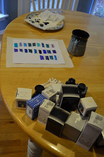
A Study in Blues
I hate blue.
Let me rephrase: I, who should know better than to deal in generalizations, hate blue.
I have always said I dislike blue ink. That, in fact, I'm not overly fond of the color blue at all.
While rooting through the cabinet which holds all of our inks, I realized that we have a goodly number of inks that arguably fall within the spectrum of "blue." Given the supply of blue ink in the house, I thought it would behoove me to become further acquainted with blue ink.
So, I gathered them all up, booted up the PC, and put together a quick list of each color. I spaced the ink names to allow for swabbing and printed it on our usual printer paper - HP 32 lb bright white.
I then grabbed a handful of cotton swabs and commenced swabbing.

And I was quickly fascinated by the variation that was almost immediately apparent in our blue inks.
I thought briefly of rearranging swabs in color order, but I like having them alphabetical by manufacturer and then color name. In fact I'm finding this so useful I will probably do the same for the other basic colorways we have - reds, oranges, browns, greys and blacks.
I've done some work with color in fiber arts, notably spinning, weaving and knitting; I've never really translated that knowledge and experience into viewing inks before though. This was an interesting eye-opener for me.
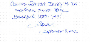
Here are a couple of color-corrected shots of the various blues. First, a photograph:


I've done my best to represent colors accurately, but of course Your Monitor May Vary. If you've got your heart set on a particular color, I highly recommend you purchase a sample from a dealer before investing in an entire bottle to avoid possible disappointment.
This was a great exercise for me; it made me acknowledge what I should already know: "blue" isn't just blue, there are myriad shades involved, each of which carries its own appeal. Even Waterman Florida Blue - an ink that I always use for testing, not for its color but because of its performance properties - draws the eye nicely.
And in conclusion, let me just show you this photograph:
Let me rephrase: I, who should know better than to deal in generalizations, hate blue.
I have always said I dislike blue ink. That, in fact, I'm not overly fond of the color blue at all.
While rooting through the cabinet which holds all of our inks, I realized that we have a goodly number of inks that arguably fall within the spectrum of "blue." Given the supply of blue ink in the house, I thought it would behoove me to become further acquainted with blue ink.
So, I gathered them all up, booted up the PC, and put together a quick list of each color. I spaced the ink names to allow for swabbing and printed it on our usual printer paper - HP 32 lb bright white.
I then grabbed a handful of cotton swabs and commenced swabbing.

And I was quickly fascinated by the variation that was almost immediately apparent in our blue inks.
I thought briefly of rearranging swabs in color order, but I like having them alphabetical by manufacturer and then color name. In fact I'm finding this so useful I will probably do the same for the other basic colorways we have - reds, oranges, browns, greys and blacks.
I've done some work with color in fiber arts, notably spinning, weaving and knitting; I've never really translated that knowledge and experience into viewing inks before though. This was an interesting eye-opener for me.
Here are a couple of color-corrected shots of the various blues. First, a photograph:

Then, a scan:

I've done my best to represent colors accurately, but of course Your Monitor May Vary. If you've got your heart set on a particular color, I highly recommend you purchase a sample from a dealer before investing in an entire bottle to avoid possible disappointment.
This was a great exercise for me; it made me acknowledge what I should already know: "blue" isn't just blue, there are myriad shades involved, each of which carries its own appeal. Even Waterman Florida Blue - an ink that I always use for testing, not for its color but because of its performance properties - draws the eye nicely.
And in conclusion, let me just show you this photograph:

Kindly note the color of the coffee cup.
Not to mention the wall.
Ahem.
Sunday, January 22, 2012
Help Me Decide Which Pen to Buy!
Hello all -
Here's the scoop: I have a few dollars' credit in my PayPal account. In keeping with my ongoing pursuit of reviewing inexpensive pens, I'd like to review either a Jinhao or Baoer, since I've never dealt with one of either maker. I went through eBay and selected a couple that I like the looks of. They are here: the Jinhao, and the Baoer.
I thought I'd try something a little different, and ask you to help me choose which pen to buy and review.
The poll is in the upper-right-hand corner of the blog. Please take a moment to vote for your favorite! (Or at least the one you'd prefer of the two!)
Voting will go through January 31, 2012, and I'll then purchase the pen and share the fun! (Hopefully it will be fun!)
And, a bonus: if the pen is something I'd call worth writing with, I'll have a giveaway for it too! I don't want to promise, in case the pen doesn't work well or something; I don't want to give you something that's not worth having! Stay tuned...
Sunday, January 15, 2012
The Sunday Post: January 15, 2012
Having two grandchildren, and seeing friends become grandparents recently, has led me to reflect a bit on my life, and life in general.
My mother had a chronic illness throughout most of her life, which led ultimately to her death when I was a teenager. The family rallied around her and my father to provide support, and part of that support was lending a hand in childcare. So, in a way, raising me was a group project.
My grandmother was instrumental in providing that care. A strong-willed woman, she was fierce in her love for me. She taught me a lot - probably as much as anyone else in the family project raising of me.
Now that I am a grandmother, a fact which sometimes is difficult to absorb, I find myself thinking back on some of the lessons she taught me. And I wonder whether I will have the talent to impart similar lessons to my grandchildren, and to be heard.
My granddaughter is three. My grandson is less than a year old. Statistically speaking, I am fairly certain of seeing them grow into nominal adulthood, but I rather doubt I'll see them into middle age.
This causes me fear. Not fear of dying, though I've no wish to leave anytime soon; fear that there are things I could do to help and to guide, and yet I won't be here to do it. I didn't have this same fear with the boys, I think partially because I was younger.
Life has its limits. And it's a fearsome thing, helping launch a human being into the world. Especially when you hear the clock ticking, albeit in the distance.
 |
| Your Author at...hmm....what age was this again? |
Monday, January 9, 2012
Pen Review: The Little Gems - my little gold writing implements
In case you haven't figured it out by now, I tend to like things that are a little - um, blingy. Sparkly things tend to make me say something like, "Ooooh, Shiiiiiiny!" before I quickly snatch them up. My husband, Joe, jokes that I don't have a jewelry box, I have a jewelry "garage" - one of those floor-standing armoire things.
Here are a few of my blingier pens, at least in terms of gold content.
 As always, all photos are clickable
The first is a Waterman 0552 1/2 V 14k gold filled fountain pen. Its intended purpose was as a vest pocket pen for a gentleman. The pattern is known as "pansy panel," as it has machine-etched pansies. (Apparently a floral-based design wasn't considered unmanly at the time - probably about 1920.) This pen was a gift from my husband for Christmas last year. The nib is rather flexy, and without much pressure writes spidery fine.
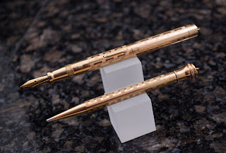
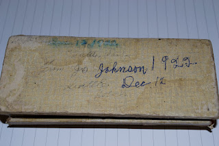
The other two items I'm featuring today are a matched set of Wahl-Eversharps in a Greek key pattern. These are kind of fun little items; I found them in their box in an antique mall in a nearby town one day while browsing. The box, which had been heavily taped with masking tape along the hinge, has written on the bottom the words "Seattle, Washington. December 12, 1922. From Joe Johnson." The pencil was in pristine shape (as they often seem to be), and the pen although obviously used was in pretty good shape, though I sent it off for resacking just in case. (It had been stored with blue ink in it, long dried. Why are these pens always stored with ink in them? And why is it always blue? See hint below!) As even the box was kept, and from the wear to the box and the obvious use of the pen, they must have been a treasured gift. So, who were you, Joe Johnson? And who was the recipient that loved these (and perhaps you!) so well?
Half the fun of these old pens is trying to imagine their history.
Both pens are lever fillers, as was common when they were made. And both have rather fine, flexible nibs.


And one perhaps doesn't realize how different in color these pens are until they are side by side. Here is a shot of the two pens, along with my engagement ring (see, blingy again), which is 14k yellow gold, for color comparison. (The ladies in the audience may well be able to determine by the style of the ring that I have been married for A Long Time. It's quite out of fashion now.) The Waterman is gold-filled, as can be told by the wear through pattern on the end of the pen, though I don't find markings indicating it. The Wahls are gold filled as well, and I believe they are rose gold.


Here are a few of my blingier pens, at least in terms of gold content.

The first is a Waterman 0552 1/2 V 14k gold filled fountain pen. Its intended purpose was as a vest pocket pen for a gentleman. The pattern is known as "pansy panel," as it has machine-etched pansies. (Apparently a floral-based design wasn't considered unmanly at the time - probably about 1920.) This pen was a gift from my husband for Christmas last year. The nib is rather flexy, and without much pressure writes spidery fine.

The other two items I'm featuring today are a matched set of Wahl-Eversharps in a Greek key pattern. These are kind of fun little items; I found them in their box in an antique mall in a nearby town one day while browsing. The box, which had been heavily taped with masking tape along the hinge, has written on the bottom the words "Seattle, Washington. December 12, 1922. From Joe Johnson." The pencil was in pristine shape (as they often seem to be), and the pen although obviously used was in pretty good shape, though I sent it off for resacking just in case. (It had been stored with blue ink in it, long dried. Why are these pens always stored with ink in them? And why is it always blue? See hint below!) As even the box was kept, and from the wear to the box and the obvious use of the pen, they must have been a treasured gift. So, who were you, Joe Johnson? And who was the recipient that loved these (and perhaps you!) so well?

Half the fun of these old pens is trying to imagine their history.
Both pens are lever fillers, as was common when they were made. And both have rather fine, flexible nibs.


Waterman nib


Wahl Eversharp nib
And one perhaps doesn't realize how different in color these pens are until they are side by side. Here is a shot of the two pens, along with my engagement ring (see, blingy again), which is 14k yellow gold, for color comparison. (The ladies in the audience may well be able to determine by the style of the ring that I have been married for A Long Time. It's quite out of fashion now.) The Waterman is gold-filled, as can be told by the wear through pattern on the end of the pen, though I don't find markings indicating it. The Wahls are gold filled as well, and I believe they are rose gold.

And here is a writing sample; I only wish my writing skills could do justice to the flexible nibs!

These little pens are fun to use, and a time capsule from a time when ladies wore elegant couturier and gentlemen used blue ink. Time traveling can be fun!
Sunday, January 8, 2012

Sunday, January 1, 2012
Review: Levenger Stanley Journal

Many years ago Levenger was among the very first to offer a leather cover refillable with either journal or calendar inserts. This was their original Stanley cover, and was offered in desk size and pocket-sized versions. I bought, or was given, a desk size in British tan with my initials embossed in the corner of the front cover.

As usual, all photos are clickable
Over time I’ve acquired an Inkleaf cover for Rhodia Webnotebooks, and a Renaissance Art Cover for Moleskines, but the Stanley journal remained in limited service for an occasional scripture study with my dwindling supply of the original inserts.
This past year when Levenger began restocking the journal and calendar inserts in the Stanley size I wondered how they compared to the original paper and even posted on FPN asking if anyone had experienced them. As time passed without a review of this new/old product I decided to invest $22 of my very own for a pair of the inserts to do the research for the overall good of the fountain pen community.
Here are my findings:
Subscribe to:
Posts (Atom)